All projects

From Zero to €500K in 12 Weeks
Transforming scattered workflows into a scalable B2B foundation that helped unlock €500k in investment and onboard 20+ clients.
Role
Lead Product Designer
(UX, UI, Research & Strategy)
Team
2 founders, CTO, 3 developers,
Marketing & QA
Duration
12 weeks
Tools
Figma · Notion · Miro · Clueify · Clarity
Overview
Slick Plus is a platform designed to help content creators distribute and monetize exclusive content for their audience.
This project focused on improving the content creation and monetization experience by simplifying workflows and reducing friction for creators managing paid content.
Results
The platform replaced a manual spreadsheet-based workflow with a centralized content management system, enabling teams to plan, organize, and publish content more efficiently.
Key outcomes included:
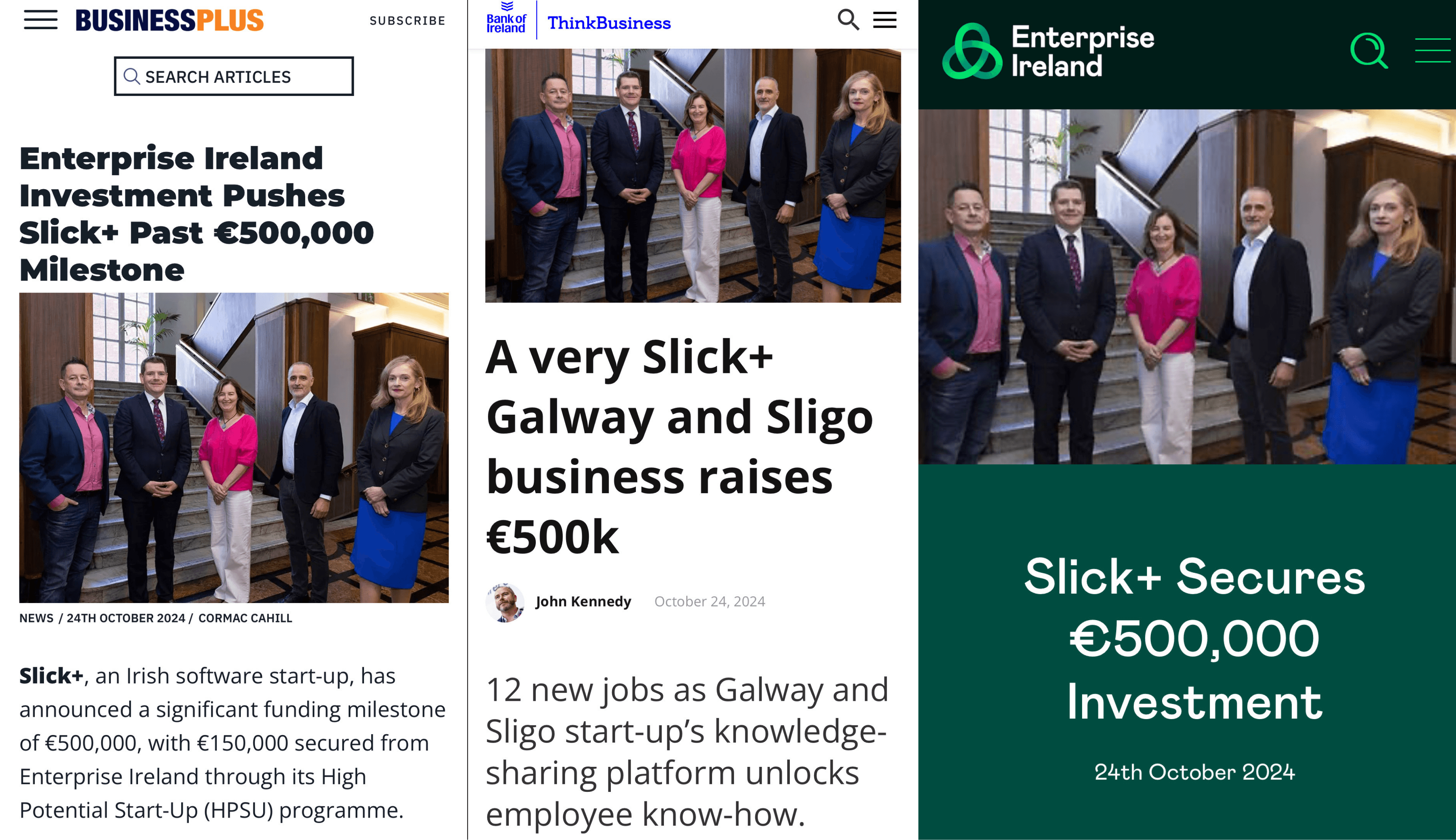
• €500K in Enterprise Ireland funding secured following the platform launch
• 32% fewer support requests related to content planning and publishing
• Content planning time reduced from hours to minutes, replacing manual Excel workflows
• A centralized platform replacing multiple spreadsheet trackers, improving visibility and collaboration across teams
Before Slick+ Admin
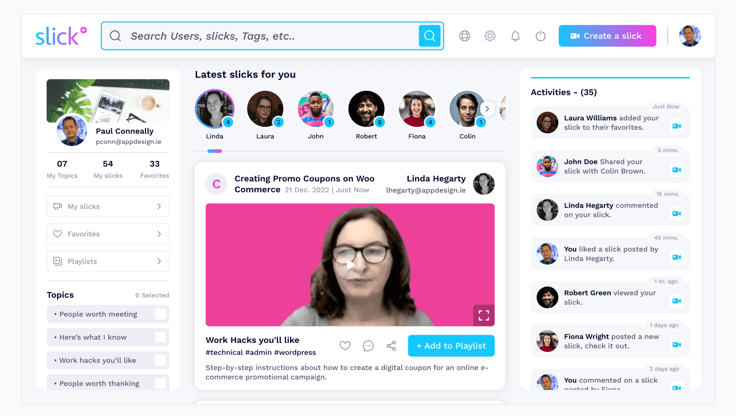
At that stage, Slick+ only offered the experience for end-users — employees consuming and sharing content within the feed.
There was no platform for organization owners or administrators to manage their workspace, structure teams, or define how collaboration and publishing should work across the company.
This gap revealed the need for a dedicated admin experience designed to support organizations operating at scale.
❌ The problem
Before the Admin Platform, admins had to:
• Onboard through support, rather than a self-serve setup
• Manually organize teams and content using spreadsheets and policies
• Guess how governance worked (roles, permissions, publishing rules)
• Lack visibility over activity and engagement
• Demo the product without administrative controls, reducing enterprise confidence
✅ The solution
With the Admin Platform, buyers can:
• Set up their workspace quickly through guided onboarding
• Manage users, teams, and permissions through structured roles
• Define publishing rules with clear governance controls
• Monitor engagement and activity through platform insights
• Demonstrate an enterprise-ready product designed to scale

Beyond the operational challenges of spreadsheet workflows, the early Slick+ interface also raised visual concerns.
The employee-facing experience followed a colorful, content-heavy design inspired by social platforms, which felt informal for enterprise environments. Because this interface defined the product's visual direction, the upcoming admin platform would inherit the same design language — highlighting the need for a more structured and mature system.
My role and team
I worked as a Product Designer responsible for shaping the product experience from discovery to final interface design.
My responsibilities included:
• User research and discovery
• Problem definition and UX strategy
• Interaction design and user flows
• Wireframes and prototyping
• Final interface design
Team
2 Founders
CTO
Marketing
QA
3 Developers
Me

Process starts here
Alignments
Kickoff findings
Early alignment sessions revealed the real gaps between business goals, user needs, and technical constraints.
These insights shaped every decision that followed and defined how the Admin Platform should exist.
Key alignment with Founders & CTO
We aligned expectations around scalability, onboarding autonomy, and overall market positioning.
Founders emphasized investor readiness, while the CTO highlighted governance gaps and MD2 limits.
These early points shaped the foundation of our initial scope.
What success should look like
Together, we defined three measurable pillars of success:
clarity, autonomous setup, and scalability for organizations adopting Slick+.
This became the North Star to evaluate all design choices and trade-offs across the 12-week timeline.
Early Constraints & Risks Identified
We uncovered MD2 framework limits, backend dependencies, and missing governance structures.
These risks required tighter scope negotiation, a clarity-first workflow, and close alignment with developers to ensure feasibility while maintaining delivery speed.
Discovery
Understanding the real problem beneath the symptoms
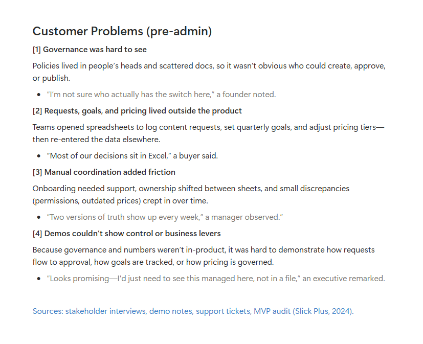
Early interviews, demo audits, platform logs, and document reviews exposed the same root issue:
governance, ownership, and publishing logic lived outside the product — scattered across spreadsheets, Slack threads, and people’s heads.
This created invisible ownership, inconsistent onboarding, and demos that couldn’t prove control or business value.
To ground the problem, I consolidated research into three pillars:
Customer problems: unclear roles, fragmented workflows, manual coordination, and demos without proof of control.
Behavior patterns: buyers needed visibility and predictability; contributors needed guidance without hand-holding.
Market standards: competitors solved this with centralized rules, built-in auditability, and predictable flows.
Key insights
From buyers (admins/owners)
• Want a clear brief and one place to track status.
• Struggle with implicit rules and off-platform changes.
• Value in-flow feedback (less rework).
From contributors
• Need guidance on what to submit and why.
• Rely on predictable approvals to avoid Slack back-and-forth.
• Want to work independently without support involvement.
From Slick’s internal team
• Must remove Excel to prove governance in demos and audits.
• Need predictable workflows for requests, goals, pricing, and publishing.
• Want a simple story of “who does what, when, and why” for leaders.
Supporting data highlights
• 68% of early demos required live support to complete setup.
• 80% of governance actions lived outside the product (mostly spreadsheets).
• 62% of requests/goals/pricing were created in Excel and re-typed later.
Competitor analysis
As part of Discovery, I reviewed how five mature enterprise platforms structure governance, ownership, and publishing flows — not to compare features, but to understand market standards for clarity and accountability.
Key patterns observed
Design implication
This reinforced the need for Slick+ to introduce a single, in-product governance layer where admins can manage roles, rules, and publishing logic — replacing manual spreadsheets and reducing operational ambiguity.
These learnings set the foundation for the Define phase, helping translate scattered problems into clear, measurable, and prioritized product objectives.
The insight
We weren’t just designing an admin tool —
we were defining the governance layer the product never had.
Define
Translating chaos into a measurable product direction
Using personas, JTBD, and problem framing, I structured all insights into a clear vision of what the admin platform needed to achieve:
Cormac (Admin Buyer) needed visibility, predictable flows, and reduced dependency on support.
Aoife (Contributor) needed simplicity, clarity, and friction-free guidance.
Governance-first workflows became the North Star — not as an add-on, but as the foundation for scale.
Through JTBD and HMW synthesis, three strategic requirements emerged:
Make governance visible inside the product
Centralize rules, requests, and goals
Enable self-serve onboarding without relying on support
To keep delivery within 12 weeks, we prioritized features using a lean MoSCoW model — aligning founders’ expectations, de-risking scope, and ensuring we focused on what unlocked scalability first.

Develop
Transforming strategic insights into clear design direction
With the problem aligned, I moved into rapid ideation cycles — mapping flows, exploring governance logic, and validating decisions directly with the CTO and founders.
Design Explorations
Rebuilt end-to-end workflows (org setup → goals → labels → content requests).
Created low-fidelity wireframes that tested navigation, visibility, and table hierarchies.
Defined a governance-first information architecture with clear ownership, approvals, and auditability.
Throughout delivery, I worked closely with engineering to validate feasibility inside our Material-Angular v2 limitations — simplifying components, reducing rework, and maintaining the delivery speed investors expected.
Why this mattered
The goal was not only to design an admin area — but to eliminate the manual work that blocked scalability and enable a demo-ready product investors could trust.

Deliver
Translating validated concepts into interfaces and dev handoff
The final admin platform established a scalable foundation for Slick+ — balancing governance, usability, and operational efficiency.
Key Improvements
Clear governance layer: roles, approvals, ownership, audit logs.
Content Planner centralizing requests, goals, and publishing logic.
Cleaner table patterns, simplified navigation, and predictable workflows.
A UI system compatible with Material guidelines and future scalability.
I worked closely with developers to validate feasibility inside material-angular v2 constraints, avoiding rework and maintaining delivery speed.
This release became instrumental for demos, onboarding, and internal workflows — directly contributing to the platform’s growth and investment milestone.

Launch
And then we launched!
After the first development cycle, Slick+ was officially introduced during the Social Learning Summit, where the platform was presented to organizations, partners, and stakeholders.
The event marked the first public exposure of the product and provided an opportunity to demonstrate how the platform could replace the previous spreadsheet-based workflow.
This moment was crucial not only for validating the solution in front of real organizations, but also for strengthening the product’s positioning as a scalable learning and governance platform.
During this period, the project also secured €500K in investment from Enterprise Ireland, enabling the team to continue developing and expanding the platform.

Social Learning Summit 2024
Launch
Product Evolution — Phase 2
Following the initial launch and early adoption, the team gathered feedback from organizations using the platform in real environments.
These insights led to a second phase focused on improving usability, clarity, and visual consistency across the system.
This phase included:
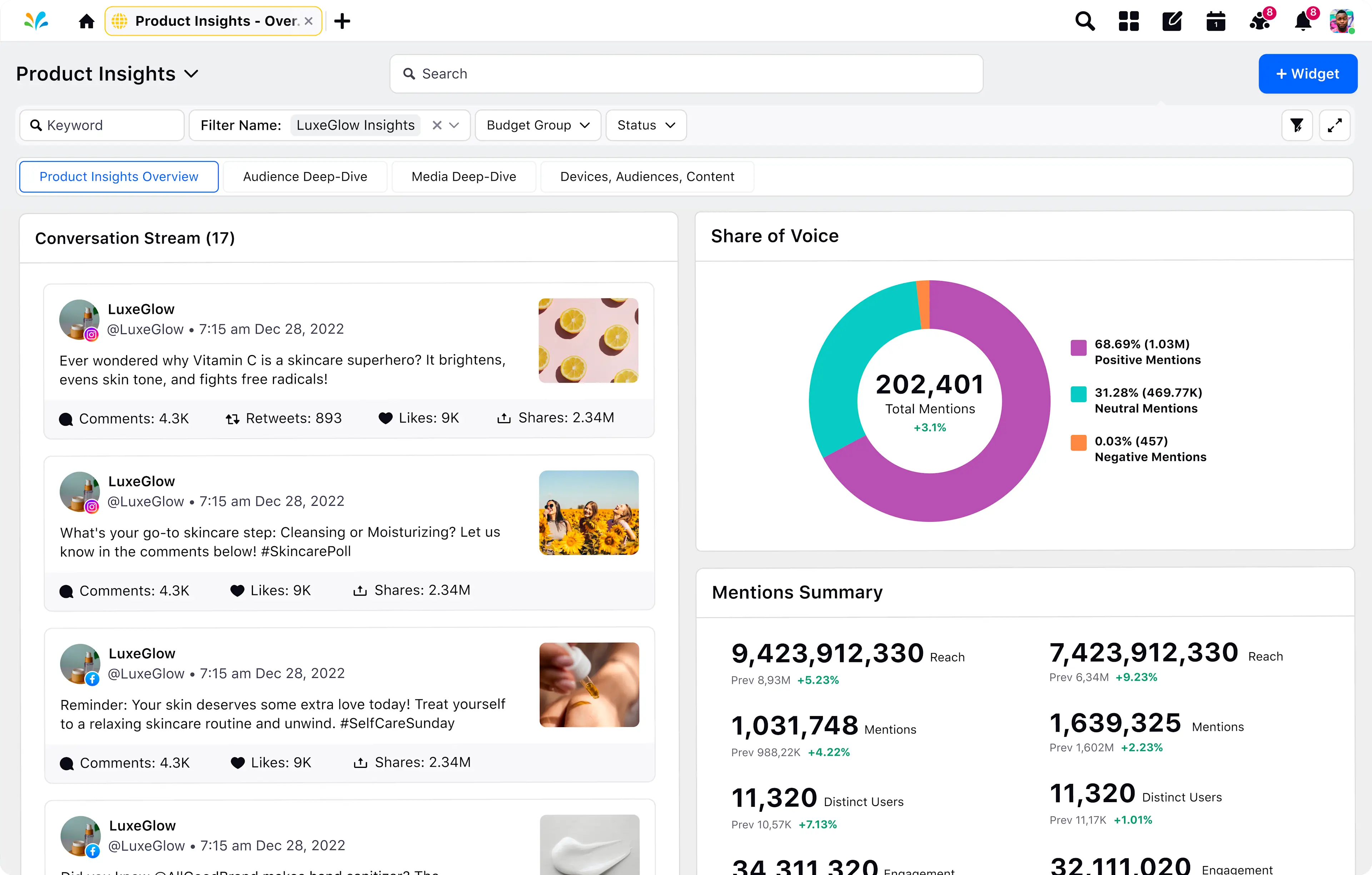
• A modernized interface aligned with contemporary SaaS patterns
• Improved information hierarchy and navigation
• More structured data visualization for organizational insights
• Refinements to the admin configuration experience
Rather than a new launch event, this update was released as a product evolution, strengthening the platform's usability and scalability.


Launch
Industry Recognition
As the platform matured and expanded its adoption, the project gained recognition within the regional innovation ecosystem.
Slick+ was later awarded Business Excellence Award – LEO Excellence Award, recognizing the platform as one of the most promising entrepreneurial initiatives in the region.
This recognition reflected not only the product’s technical progress but also its impact in helping organizations manage learning, collaboration, and governance more effectively.


Thanks for reading!
Overall, this project pushed me to operate at my highest level — navigating constant iterations, alignment with teams, and tight timelines. Seeing my work directly shape the future of a growing company reminded me why I love being a Product Designer: I get to help build things that truly move people and businesses forward.